T-Mobile’s new “next gen”coverage maps: Hit or miss?
T-Mobile fan or not, you can’t escape the carrier’s influence on the modern market. Before the company’s Un-carrier moves, the only discussion about network operators were generally complaints about signal strength (or lack of it). It takes something special for people to actually care about a carrier, and take notice of what it’s doing.
Having recently launched Uncarrier 9.0, the carrier promises it’s not done yet and is moving confidently forward with its plans to remove customer pain points. One step at a time. But its Uncarrier philosophy stretches far beyond awesome offers. It’s not all about the glitz and glamour of launch events. It’s about changing the industry. Some of those steps include things like proactively refunding customers charged for premium SMS services, or lobbying the FCC to make roaming fairer for the small guys.
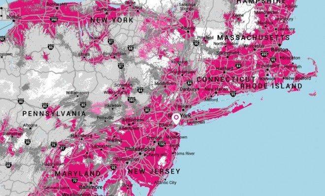
One of the lesser publicized moves is the latest change to the network coverage map. And its intention with the map is admirable. Instead of just showing where you should have coverage, it shows areas where the signal is “verified”. In other words: Where customers can actually get an LTE signal. In theory, it’s fantastic. Especially with its promise of updating frequently and showing almost real-time results.
But it doesn’t come without its problems. After the map was published, many of sounded off in the comments complaining that the map still wasn’t accurate. And was actually less useful. Others – like me – were pleased with the step T-Mo had taken. But there is reason to be concerned, or at least, mildly skeptical.
Peter Cohen of iMore recently published a couple of articles, one of which details a conversation he had with T-Mobile’s VP of Engineering, Grant Castle. Cohen (@flargh on Twitter) had written an article previously which detailed his experience of the T-Mobile network. Long story short: He needs a signal booster at home and regularly fails to connect to the LTE, and struggles with terrible audio quality on phone calls. And yet, the new map proudly fills his entire area with a deep magenta shade as if to say “all’s good here, you’re in LTE wonderland!” When the reality is far different.
“Mr. Castle admitted up front that the engineering models that his company and other cellular carriers use to determine coverage maps aren’t perfect, but says that T-Mobile’s goal really is to improve accuracy by incorporating customer data into the matrix as well.”
As luck would have it, there is a way to input your experience of T-Mobile’s network in to the map. If you have the My Account app from T-Mo, you get the option of sending diagnostic information anonymously to the carrier. This shows T-Mobile where and when you’ve connected to LTE without giving them any other, more sensitive, information. The app can even tell the difference between a Wi-Fi and LTE connection so it won’t send “great signal here” messages when you’re using Wi-Fi.
But the problem could arise when you have a signal booster. Like Cohen, if you have an LTE signal booster in your home magically transforming 1 bar of LTE in to 5 bars, the T-Mobile diagnostic information being sent by the app says “WOWSERS! Perfect LTE!”. And the writer’s other point, is that it only takes a connection to LTE – even 1 bar – to tell T-Mobile that there is LTE in that area. Even if it’s shoddy. It’s basically just a “yes” or “no” response to LTE. If you have LTE, it’s painted pink. If you don’t, it’s not. Who cares if you only get 1-2 bars.
Thankfully, it still takes “a statistically valid number of samples” before T-Mobile adds the “verified” check mark on to the maps. So if you’re the only person with a signal booster on your street, it’s hardly likely that T-Mo’s data will think your entire location has the best network coverage. But there’s still the issue of where it says there’s LTE coverage. On the big picture side, there’s no real distinction between low signal strength areas and strong signal strength, unless you zoom in close enough and click on individual streets or roads.
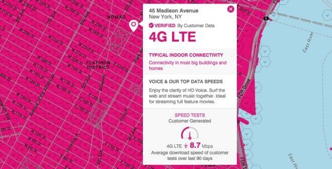
My question is, could T-Mobile do more to more accurately display what kind of experience a customer should expect in any given area? Right now, if you click on a specific street on the map you’ll get a popup similar to the one below which could show speed test results and network performance.
But can customers really be expected to click on every street they visit to see what network strength is like. Or should there be an instantly visible layer of the map which shows accurate network coverage?
I wouldn’t say I’m disappointed with the carrier. T-Mobile has done well to incorporate this kind of information in to the map already. In fact, it’s miles ahead of the competition in that regard. But can it do more? Does the new map accurately show your location’s LTE as it should? Or is it misleading as Peter Cohen suggests it is?
Let me know your thoughts on the new map in the comments.