Spot the difference: Verizon’s old map of T-Mo LTE coverage vs. the new map
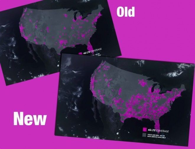
Late last year, Verizon got in to a little hot water over its representation of T-Mobile’s coverage. In fact, it was asked by the National Advertising Division to end its “More Everything” campaign. Long story short, VZW made it look as though T-Mobile had virtually no 4G coverage by excluding its HSPA areas, and by using old data. This was back in November. But, it seems it was up to its old tricks again at the beginning of December, as you can see from the video’s opening few frames below:
It’s worth noting, that the first video was published on YouTube on the 1st of December. Just over a month ago. Check the opening frames of the latest video (published yesterday):
With the tagline “Never Settle”, the same used by OnePlus in its marketing for the OnePlus One, Verizon posted the ad to show how superior its network was in comparison to the competition. And there’s no denying it, Verizon’s LTE network does cover a larger surface area than T-Mobile’s, and is therefore available to more consumers. But the difference in its portrayal of T-Mo’s network is quire startling:
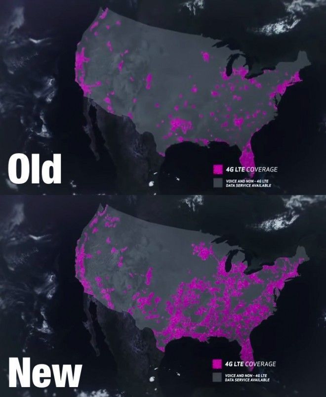
Now, either both maps are correct and T-Mobile has done some incredible LTE deploying over the past 5-6 weeks, or Verizon was being purposefully misleading in order to dissuade potential customers from signing up to T-Mobile’s competitive offers. Or perhaps, it was put off at the thought of another lawsuit with T-Mo.
On a more serious note, it’s still clear that T-Mo is behind the biggest two carriers when it comes to LTE coverage. But it is continuing to grow, and it has plans to reach 300 million people by the end of this year as well as continue rolling out its 700MHz network and wideband LTE coverage.
Does the new map look more accurate to you?