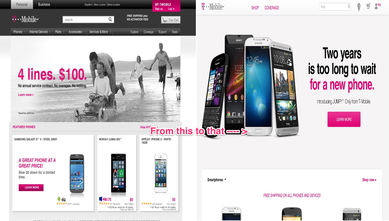
T-Mobile Rolling Out New Website Design With Cleaner Look, Lots Of Free Space
I wouldn’t say a new website design for T-Mobile is monumental news but as someone who appreciates simple and clean websites, the new look is something I’m digging. For some there may be a too much white/empty space, but the site is definitely simplifying the number of options one must choose to move through T-Mobile’s smartphone and rate plan selection. Gone are the scrolling “featured” sites and replaced with one HUGE section promoting T-Mobile’s JUMP! program. Moving further below takes you to the company’s smartphone selection with an option to “Shop now.” Scrolling further down will bring you to the coverage, accessories pages and finally a “Switching is painless” section, a “Why T-Mobile” section and Live chat.
I believe the rollout is happening slowly and might require a cache clearing to show, but it sounds like plenty of you are already starting to see it as “live.”
What do you think about the new look? Is cleaner really better?