


T-Mobile has long offered a coverage map so that you can get an idea of what the service will be like in your neck of the woods. Now T-Mo is making it easy to compare its own coverage against those of its competitors, too.
T-Mobile has added an LTE comparison map to its website. The map is just what it sounds like, letting you compare T-Mobile’s LTE coverage to that of AT&T, Sprint, and Verizon. T-Mo is selected by default, and then you can select one of the other big three carriers to have their LTE coverage laid out simultaneously so that you can easily compare the two.
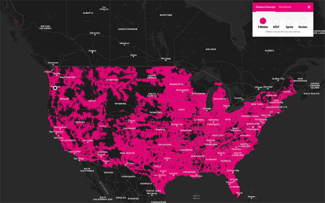

It’s worth noting that the T-Mobile LTE coverage shown on this comparison map is its end of 2017 projection. When T-Mo last reported its LTE coverage in February, it was at 314 million POPs of coverage, with the goal of expanding to 320 million people by the end of 2017.
T-Mo has been putting in work to expand its LTE coverage in recent years, and lately it’s been touting that its LTE network reaches 99 percent of the people that Verizon’s LTE network does. Now that it feels like its coverage is nearly the same as Verizon’s, it appears that T-Mo wants to drive that home by making it easy to compare its LTE coverage to Verizon’s as well as AT&T and Sprint. Of course, the best way to the determine cellular coverage is to try it out for yourself, but these maps can be used as a starting point when learning about the carriers’ coverage.
Speaking of T-Mobile’s LTE expansion, the same webpage that hosts T-Mo’s LTE comparison map also has a “View Growth” map that’ll let you compare T-Mobile’s LTE coverage in 2014, 2015, 2016, and the 2017 year-end projection. You can check both maps out for yourself at the link below.
Thanks, Thomas!
Source: T-Mobile