T-Mobile’s new real-life LTE coverage map – now with more magenta
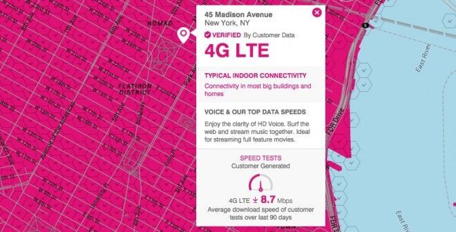
You may remember, towards the end of March, T-Mobile announced and launched a brand new coverage map. It promised it would be in near real-time and give realistic coverage expectations. Unlike the traditional coverage maps, it doesn’t hold on to old data and fail to update. Instead, it uses crowd-sourced information along with its own data to show how good, or bad, coverage actually is. Or at least, that was the plan.
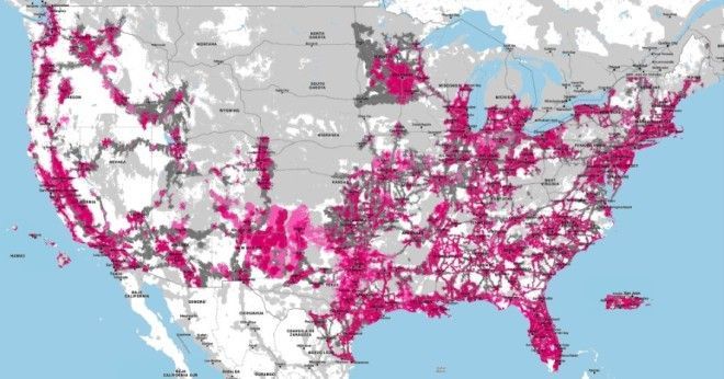
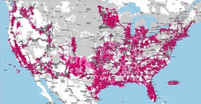
The rate at which the coverage data has been updated is pretty impressive. It’s only been live for a few weeks, and already we can see a real difference in the number of areas covered by T-Mobile’s LTE. The simple two-frame GIF was created by one of our readers, Marcos, who took a screenshot of the US map when it first launched and again a couple of days ago. If the updates are accurate, T-Mobile’s LTE engineers are working furiously to meet that 300 million people target:
UPDATE: For whatever reason, the GIF isn’t working. So instead here’s a “before” frame snapped at the end of March –
And here’s after –
Exactly how accurate this info is compared to what customers experience is yet to be seen. Although it may have been inaccurate to begin with, I think this is one of those services that can only improve its accuracy and reliability with time. As the company pulls in more usage data it can make more realistic claims about coverage and speed. And that can only be a good thing.
You can check it for yourself at t-mobile.com/coverage.
Thanks, Marcos.